I love B&W photos although I almost never shoot in B&W. Usually I just see a picture and then see how it looks in B&W later. I wanted to show a little editing I found on Picasa - I'm sure many have used this before, but this photo really demonstrates it well. Here is the unedited version.
 Here is the regular B&W conversion. See how everything looks the same intensity.
  Then I tried the filtered B&W tool on the effects tab in Picasa (be sure to undo the regular B&W first). Then you can move the cursor around to see what different shades you can get. By selecting something in the pink range, it makes everything pink look lighter which really makes the flower stand out. Then I did auto contrast and a little sharpening. Viola!
 Is it OK to have a little color? Because I can't talk about editing B&W without including a shot like this. Before cropping and editing it was a little boring because no one was looking at the camera, but now I like it.
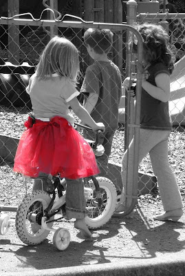 Here is the color accent tutorial from Pioneer Woman if you have Photoshop.
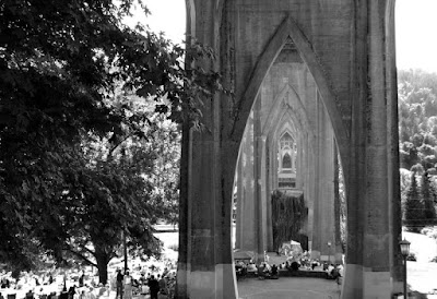
 Last weekend we went to the Cathedral Park Jazz Festival in Portland, OR. The park is under the St. John's bridge, which most people agree is the best looking bridge in town. Here's a view from under the bridge.
Here is one of my favorite photos of the St. John's Bridge that I took a while ago, but I really have to share it. It's the first time I took a cool picture of something other than my kids.
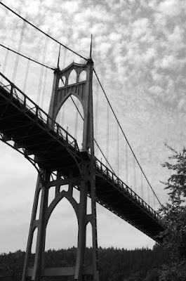

Here is one of my favorite photos of the St. John's Bridge that I took a while ago, but I really have to share it. It's the first time I took a cool picture of something other than my kids.

To see all the other great B&W You Capture photos click here.

13 comments:
These are just gorgeous! I especially love the red tutu...Xx
I love the b&w flower! Neat trick! Also love the red tutu, but then again, I love b&w with a hint of color!
All of your photos are stunning - beautifully done!
Much improved on that first one!
And the others are beautiful also.
What a great, user-friendly post!! Love all your photos, especially the bridge.
great pictures, I've been playing with Picasa...I just don't get it...lol.
That bridge picture is pretty cool. Black and white gives a different perspective to pictures.
The red tutu is GENIUS. Love it.
Thanks for the tricks! I will try them!
Awesome! I wasn't sure how to make my B&W shots "pop", either! Thanks for the Picasa tutorial! I love that tutu!
Oh, I love your pictures. And you are so right. Sometimes removing the color from pictures leaves them flat! Thanks for that link too! So helpful!
Love the photos. My favorite is the bridge. :)
These are great! The bridge was one of my favs, and the red tutu made taht picture perfect!
Post a Comment